Case study: design for Cymorth Addysg
Cymorth Addysg offers specialised tutoring and coaching to support individuals facing challenges in their studies or employment due to neurodiversity or disabilities. They also provide interactive training to raise awareness and improve support for neurodiverse and disabled individuals in educational and professional settings.
Helen, director of Cymorth Addysg, approached us last year and asked if we could create a visual identity for her business. Loving everything about her business and where she aims to take it, we were excited to work with her on this project! Since completing this project, we’ve also worked with her on a number of design assets for her business too, some of which you can see below.
A5 Flyer (Welsh & English)
A double-sided flyer describing all of the services that Cymorth Addysg provide. On the one side all of the information is shared in English, and on the other side all of the information is shared in Welsh. Due to the difference in copy, some of the design differs to best suit the text layout on each side.
Carousel Templates (Canva)
We designed a series of carousels and individual social media posts for Cymorth Addysg covering their most regular content themes. Finalising these in Canva means that they’re accessible for Helen and her team to use and edit to generate content consistently themselves. Some of the other templates we created for them include: testimonials, top tips, did you know, service details. Each template came with a few variations to give them flexibility to use them for each different service.
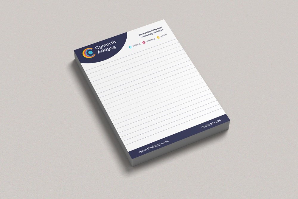
Notepad
We designed this notepad ahead of an event Helen was attending - opting to keep a simple layout that gave an overview of the services her business provides and contact details whilst leaving plenty of space for those all-important notes, lists, and ideas.
Roller Banner
For the events Helen attends, it’s really important that her resources are available in Welsh as well as English. Here, we used the blue circle to separate the different languages. Adding her QR code at the top meant it could be scanned from afar, and in keeping with her branding we used her soft blue and navy for the QR code design (it doesn’t only have to be in black and white). We added her most important details at the top (her website and a short bold summary of her services) so it could be easily read and remembered by people passing by or taking a photo.
Branding
You can read more about the branding we developed for Cymorth Addysg here.
You can connect with Helen on LinkedIn and her website.
Would you like designs for your business? Contact us or book in a free discovery call and let’s chat about what we can do for (and with!) you.
Bloom Creative is a design and branding business based in Kent who support local and national businesses with a range of services that enhance their brand and get them seen and remembered, including: engaging digital content, eye-catching print design, and bespoke branding & brand refreshes.
If you’re interested in our services and/or getting to know us better, you can book in a virtual coffee break call with founder Amy Walters.


